
On a laptop, the logo is red, on a phone, it shifts toward orange, and on the finished t-shirt, it looks different again. Which color is correct? If the image on the screen is the only point of reference, it's hard to decide.
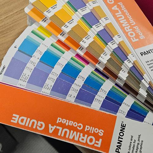
That's why physical Pantone color guides are used when determining print colors. They allow you to point to a specific swatch that the designer, client, and print shop should reference. However, you need to know which color guide to choose and how to use it.
What is Pantone used for?
"Dark navy" will be almost black to one person and distinctly blue to another. When ordering apparel, such a description leaves too much room for interpretation. Pantone structures this conversation: instead of describing a shade, you provide its designation and point to a physical sample.
In screen printing, this is especially important for corporate colors. The logo on the next batch of t-shirts should maintain the agreed appearance, even if several months have passed since the last order. The color number provides a point of reference when preparing the ink and evaluating the print.
However, this does not mean that the code alone guarantees an identical effect on every fabric. Pantone sets the target, and achieving it also depends on the material and the printing method.
Solid Coated and Solid Uncoated - what's the difference?
In Pantone Solid guides, you will find spot colors. In screen printing of this kind, a given color is obtained from specially prepared ink.
The two main versions of the guide are:
Solid Coated, designated with C - swatches printed on coated paper. Colors often feel deeper and more saturated.
Solid Uncoated, designated with U - swatches printed on uncoated paper. The paper absorbs ink differently, which changes the appearance of the color.
The letters therefore refer to the paper on which the color guide is printed. They do not indicate the type of textile ink or the type of t-shirt. The same printing ink can look different on both substrates - hence the differences between swatches with the same number ending in C or U. Pantone's explanation.
Which guide to choose for water-based ink, and which for plastisol?
When choosing a color target for apparel printing, the following tip is useful:
Uncoated can be a good point of reference for a matte print, for example made with water-based ink.
Coated often better matches satin or slightly glossy prints, for example made with plastisol.
This is a tip regarding expected appearance, not a strict technological divide. Simply saying "water-based ink" is not enough to automatically choose U. What matters is the specific ink, its finish, and the target agreed upon with the print shop.
Do not change C to U on your own just because the type of ink changes. If the brand guidelines specify a color ending in C, provide that exact code and explain what effect you want to achieve. Choosing a different swatch requires a conscious decision because it changes the point of reference.
Why don't we match colors to a monitor?
A screen emits light, whereas a print reflects ambient light. For this reason alone, the image on a monitor and the ink on a t-shirt do not behave the same way.
Added to this are device settings: brightness, color profile, night mode, or automatic color warming. The same file can look different on two screens standing side by side.
A mock-up helps evaluate the logo size, placement, and composition. Production color is best approved on a physical sample. Pantone recommends using fresh, un-faded swatches when translating a design from screen to actual product. Pantone's physical sample recommendations.
A photo of a color guide doesn't solve the problem either. The camera captures its own interpretation of the color, and the screen displays it again. A photograph can help indicate which swatch you mean, but it doesn't replace it when approving the shade.
How to properly select a color from the Pantone Solid guide?
1. Start by establishing what the target is.
If the brand has a specified Pantone color in its brand guidelines, check the full designation. If the reference point is a previous print or a physical product, compare the color guide directly with it. If you only have an RGB, HEX, or CMYK file, treat the automatic conversion as a suggestion to be checked on paper.
2. Agree on the guide version.
Before choosing a shade, confirm with the print shop whether you are working from Solid Coated or Solid Uncoated. This ensures both parties compare the results against the same swatch.
3. Pay attention to lighting.
Controlled D50 lighting is used for professional comparison of graphic swatches. Pantone even offers indicators to check if conditions are suitable for color evaluation. Pantone Lighting Indicator D50.
In practice, avoid picking shades under a random warm lamp or in mixed light from a window and ceiling lighting. View the sample and guide simultaneously under the exact same conditions, ideally against a neutral background and without glare.
4. Compare several adjacent shades.
Don't stop at the first color that seems right. Hold up a swatch that is slightly lighter, darker, warmer, and cooler. Differences are easier to notice side-by-side than from memory.
5. Record the full designation.
An example format is PANTONE 186 C. The number "186" alone leaves ambiguity. The full code should appear both in the order details and next to the respective color in the design file.
6. For demanding projects, approve a sample print.
When the shade is critical to the brand, agree on making a sample on the target material. Evaluate the finished print after curing and cooling. Keep the approved sample as a reference for future orders.
Does the t-shirt color affect the result?
Yes. The same ink can look different on a white t-shirt, a black sweatshirt, and a natural cotton bag. Print opacity, fabric texture, and the use of a white underbase all matter.
An underbase helps isolate the print color from a dark background, but it also affects the final appearance of the color. That is why matching the color guide needs to be evaluated on a sample produced under actual production conditions.
What to send to Print Union?
Include full Pantone designations, garment color and model, and whether you expect a matte, satin, or glossy finish in your artwork submission. If the shade must match a previous print run, let us know and provide a physical sample.
Don't have a color guide, or only RGB is specified in your brand book? Send the artwork and describe the desired effect. We will determine how to select and approve the color prior to printing so the decision doesn't depend on your phone settings.